Brand Guidelines
Brand guidelines
Who we are
Our purpose
At WithMe, Inc., our purpose is to make people’s lives better every day. We deliver on that through convenient, technology-powered amenities for the multifamily industry and beyond. Our PrintWithMe and SipWithMe solutions make resident printing and coffee simple, helping property management leaders deliver an elevated living experience and meet evolving resident needs for remote/hybrid work spaces, while decreasing spend, controlling costs and saving time for staff. PrintWithMe powers printer amenities and staff solutions at thousands of multifamily, cafe and coworking locations across all 50 states. And, SipWithMe, which is now available in major markets, is disrupting the coffee amenity category. WithMe is an Inc. 5000 fastest growing company, appearing on both the 2021 and 2022 lists.
Our mission
WithMe, Inc.’s mission is to deliver convenient technology-powered solutions that create elevated living experiences. WithMe, Inc. was named one of the top 1500 fastest-growing private companies in the United States on the 2022 Inc. 5000 list. Its flagship subsidiary, PrintWithMe, LLC, powers printer amenities and staff solutions at thousands of multifamily locations across all 50 states. Its newer subsidiary, SipWithMe, LLC, was launched in 2021 and is now disrupting the coffee amenity category in the multifamily space. To learn more, visit www.withme.com.
Our vision
We are the leading supplier of tech-enabled amenities for the multifamily industry and beyond. We strive to improve the lives of 100M people globally.
Our solutions
We are the leading supplier of tech-enabled amenities for the multifamily industry and beyond. We strive to improve the lives of 100M people globally.
Our values
Performance
The WithMe team believes in moving fast, delivering on time and taking ownership over our results. We rapidly and effectively course correct when needed. We are not afraid to disagree, but we also believe in committing to and co-owning leadership decisions.
Candor & transparency
At WithMe, we are not afraid to have difficult conversations. We believe in the power of speaking candidly, being transparent and welcoming feedback. We make it a point to go directly to whomever can best help so we can respond to everyone sincerely and promptly.
Customer obsession
In all circumstances, we strive to outperform client and customer expectations. We obsess over feedback, with the belief that there is always opportunity to learn, to grow and to improve. Committed to innovation, we think big to continue expanding our impact.
Respect
WithMe is a diverse team committed to respecting its stakeholders, including the environment. Internally, we respect each other by being inclusive, punctual, attentive, flexible and assuming positive intent. Personal and professional development is encouraged, and outstanding performance is rewarded.
Who we serve
Primary audience: clients
Types
- Multifamily & student housing properties: includes the property manager, and executive/regional/individual property management personnel
- Commercial properties: includes coworking spaces, coffee shops, hotels, DMVs
Concerns
Maximizing revenue and profitability, reducing wasteful spend, improving resident retention/renewals, increasing occupancy, keeping client-owners happy, NOI.
Needs
Amenities that meet resident wants as well as appear valuable during leasing tours; the ability to justify cost and beat competitive bids
Secondary audience: end users
Types
Residents, students, everyday consumers
Concerns
Finding convenient, nearby solutions that fit their lifestyles; meeting their daily work/school/personal needs
Needs
Easy and convenient options for printing, coffee, and more; access to support
Barriers to adoption
Awareness: Not sure where to go or what WithMe offerings are available to them; what their free allowance includes; if they need an app to use (they don’t)
Tertiary audience: potential employees
Types
Qualified candidates looking for career opportunities
Concerns
Wondering if the job they’re applying to is legitimate; is the job a right fit
Needs
Clear and easy-to-find information; accessible job postings; testimonials from other employees; easy way to apply
Barriers to adoption
Finding information about the company; confusion around parent/sub brands
What we do
Client-centric value pillar
Decrease spend & control costs
Save time & hassle for staff
Elevate your resident experience
Provide eco-friendly amenities
Client-centric value headline
Enjoy set fees and predictable budgeting across package options while curbing consumption costs through our Print/Cup Allowance® system.
Easily manage our amenities with automated supply reordering, monthly reporting and live customer support.
Deliver thoughtfully curated amenities that leverage modern, human-centered applications that will keep residents happy and loyal to your properties.
Go green with amenities that utilize sustainable materials and eco-friendly practices that you and your residents can feel good about.
Logo usage
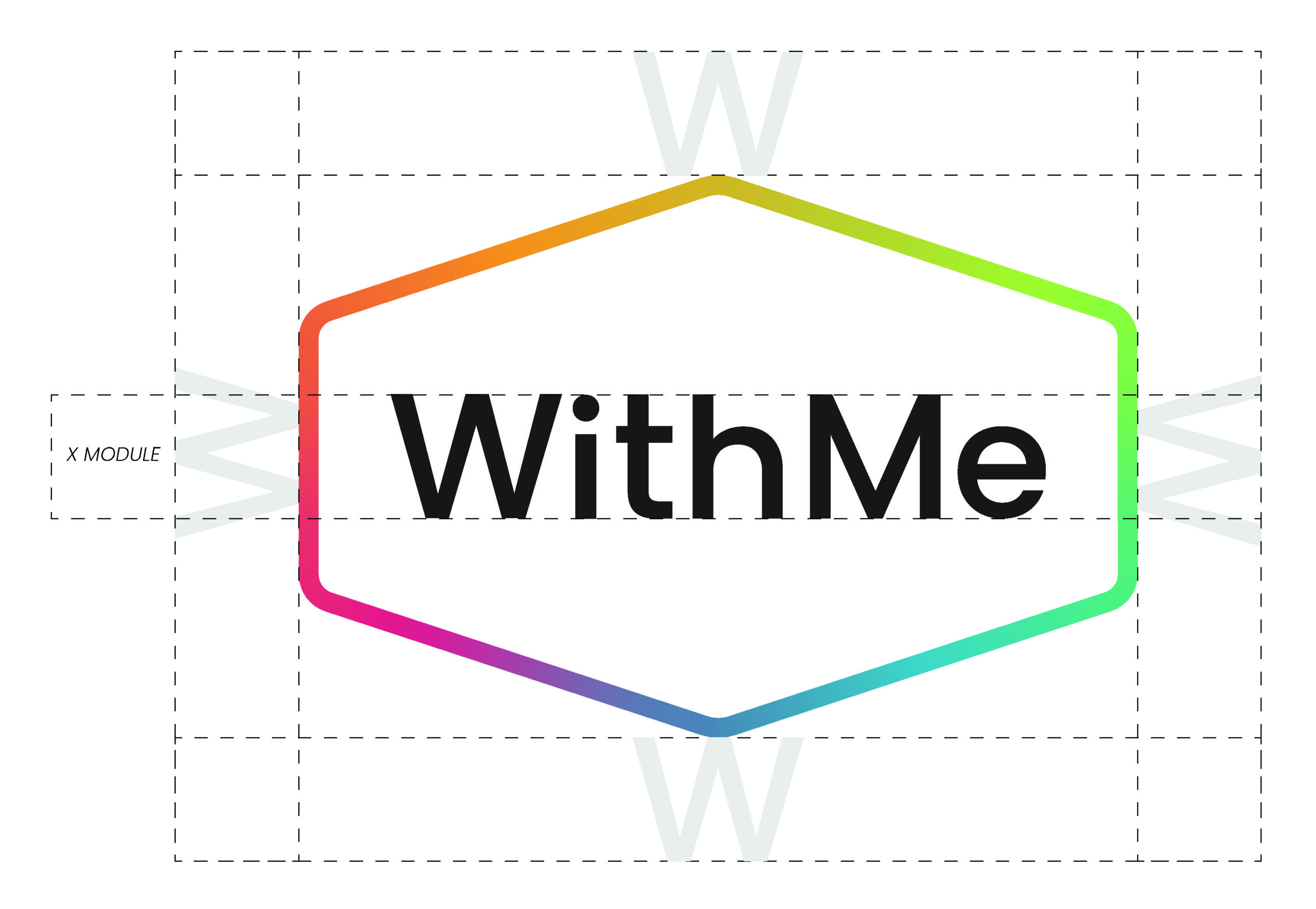
The WithMe logo is a combination mark composed of a name enclosed within a hexagonal container. The hexagon provides structure, balance, and a distinctive silhouette that ensures recognizability across formats and sizes. Its geometric form conveys precision and reliability while acting as a flexible frame that adapts well to both digital and physical applications.
Clear space
To define our X module, we take the height of the W in the wordmark, as it is the tallest character and anchors the overall structure. This measurement sets a consistent foundation for spacing, alignment, and scaling. It ensures clarity and balance across all applications, regardless of format or size.
Minimum size
The minimum logo size is defined by optical legibility rather than proportional grid scaling.
For 1:1 and 5:4 formats (13×13 and 13×15 grids), the logo must not scale below 3 horizontal grid units.
For 16:9 formats (13×23 grid), the minimum increases to 4 horizontal grid units to preserve clarity at wider aspect ratios.
These minimums were established through visual testing to ensure clarity and consistency across formats.

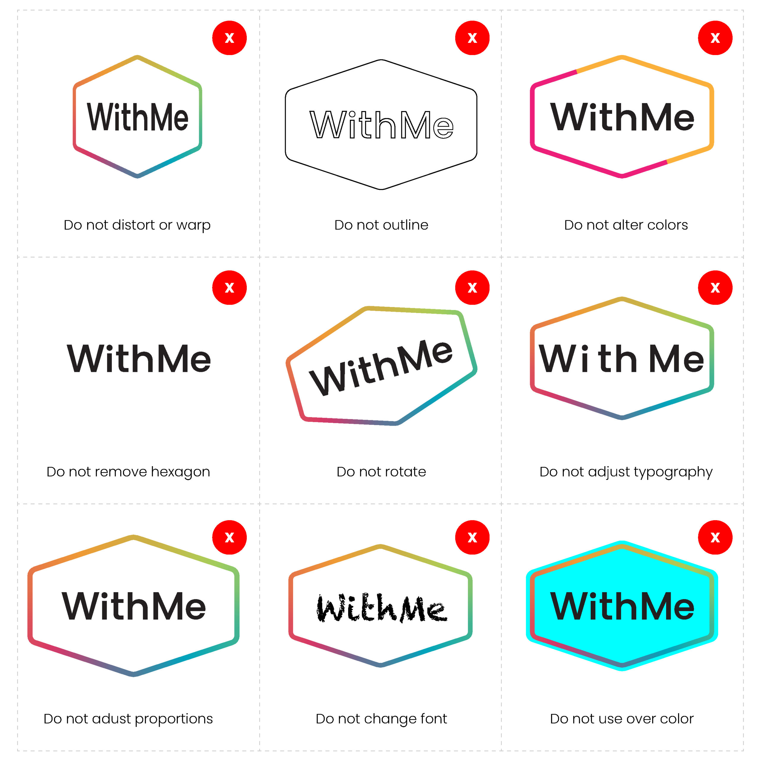
Incorrect usage
The logo plays a central role in our visual system. To keep it strong and consistent, avoid making changes to its color, orientation, or composition. Do not distort, warp, or outline it. To help maintain clarity, we’ve outlined the most common mistakes to avoid when working with the logo.
Logo downloads
WithMe logo | Digital RGB
Color system
Primary colors
Pacific blue
PANTONE®: 3125 C
Hex: #00A6BE
RGB: 0, 166, 190
CMYK: 77, 14, 22, 0
Cabaret
PANTONE®: 198 C
Hex: #D63B65
RGB: 214, 59, 101
CMYK: 11, 92, 44, 0
Deep saffron
PANTONE®: 804 C
Hex: #F09D37
RGB: 240, 157, 55
CMYK: 3, 44, 90, 0
Conifer
PANTONE®: 367 C
Hex: #A3D25D
RGB: 163, 210, 93
CMYK: 40, 0, 82, 0
Pale kale
PANTONE®: 7477 C
Hex: #17494D
RGB: 24, 73, 77
CMYK: 89, 55, 57, 39
Black
PANTONE®: Black 6 C
Hex: #121212
RGB: 18, 18, 18
CMYK: 60,60,60,100
Grey
PANTONE®: Cool Gray 1C
Hex: #D9D9D9
RGB: 217, 217, 217
CMYK: 14, 10, 11, 0
White
PANTONE®: White
Hex: #FFFFFF
RGB: 255, 255, 255
CMYK: 0, 0, 0, 0
Gradients
Individual color styles
Pacific blue (PrintWithMe)
Dark
#00778E
100%
#00A6BE
Light
#6EC2D1
50%
#00A6BE80
Cabaret
Dark
#9F003B
100%
#D63B65
Light
#FF7092
50%
#D63B6580
Deep Saffron (SipWithMe)
Dark
#B96E00
100%
#F09D37
Light
#FFCE67
50%
#F09D3780
Conifer
Dark
#71A12D
100%
#A3D25D
Light
#D6FF8D
50%
#A3D25D80
Pale kale
Dark
#002125
100%
#17494D
Light
#457579
50%
#17494D80
Typography
This is an H1 title
This is an H2 title
This is an H3 title
This is an H4 title
This is large text
This is body text
This is small text
Web Specifications
Style: H1 | Font: Poppins | Size: 70px | Weight: 600 (Semi-bold) | Case: Sentence: | Leading: 1.2px
Style: H2 | Font: Poppins | Size: 45px | Weight: 600 (Semi-bold) | Case: Sentence | Leading: 1.2px
Style: H3 | Font: Poppins | Size: 30px | Weight: 600 (Semi-bold) | Case: Sentence: Leading: 1.2px
Style: H4 | Font: Poppins | Size: 16px | Weight: 600 (Semi-bold) | Case: Sentence | Leading: 1.2px
Style: Large text | Font: Poppins | Size: 20px | Weight: Default | Case: Sentence: Leading: 1.2px
Style: Body text | Font: Poppins | Size: 16px | Weight: 500 (Medium) | Case: Sentence | Leading: 2px
Style: Small text | Font: Poppins | Size: 12px | Weight: 600 Default | Case: Sentence | Leading: 2px
Print Specifications
Style: H1 | Font: Poppins | Size: 48pt | Weight: 600 (Semi-bold) | Case: Sentence | Leading: 54pt
Style: H2 | Font: Poppins | Size: 32pt | Weight: 600 (Semi-bold) | Case: Sentence | Leading: 38pt
Style: H3 | Font: Poppins | Size: 24pt | Weight: 600 (Semi-bold) | Case: Sentence | Leading: 28pt
Style: H4 | Font: Poppins | Size: 14pt | Weight: 600 (Semi-bold) | Case: Sentence | Leading: 18pt
Style: Large text | Font: Poppins | Size: 16pt | Weight: 500 (Medium) | Case: Sentence | Leading: 20pt
Style: Body text | Font: Poppins | Size: 12pt | Weight: 400 (Regular) | Case: Sentence | Leading: 16pt
Style: Small text | Font: Poppins | Size: 9pt | Weight: 500 (Medium) | Case: Sentence | Leading: 12pt
Visual Language
Product photography
Photography is a core part of our brand identity. It not only showcases our products but also communicates our values — clarity, usability, and trust. Each style serves a distinct purpose, ensuring our imagery feels consistent across every channel while remaining flexible enough to address different audiences, contexts and needs.
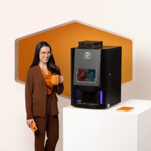
- On White
Minimalist product shots on a pure white background. This style eliminates distractions and keeps the focus entirely on the product.
Primary Use: Sales decks, customer support collateral, product specification sheets.
Why It Matters: Ensures technical accuracy, consistency, and clarity when details are most important.
- On-Brand
Product photography on light, branded backgrounds, often paired with simple props such as a smartphone. This style communicates the balance between product functionality and the tech-forward experience.
Primary Use: Marketing materials, website product pages, product one-pagers.
Why It Matters: Extends the brand into product presentation while staying clean, modern, and instantly recognizable.
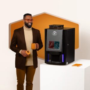
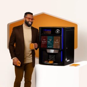
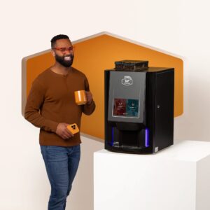
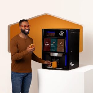
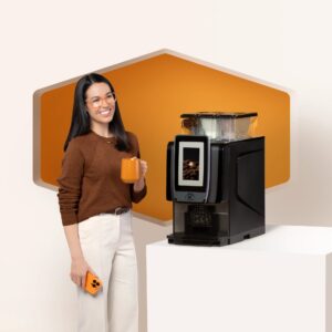
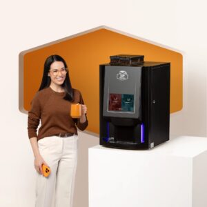
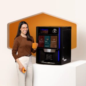
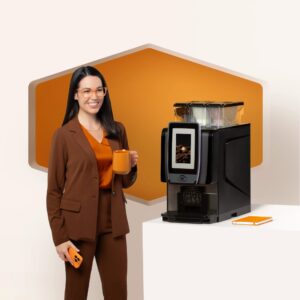
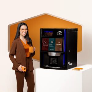
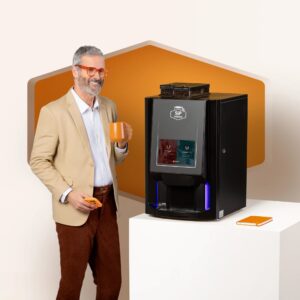
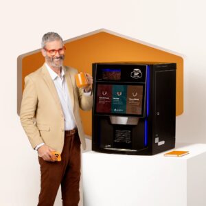
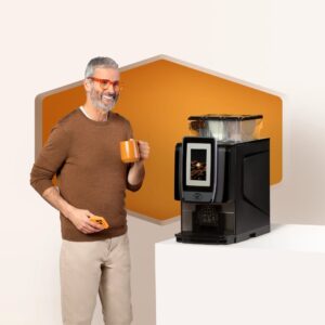
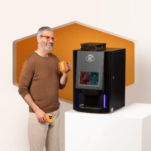
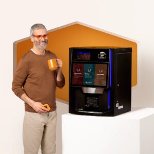
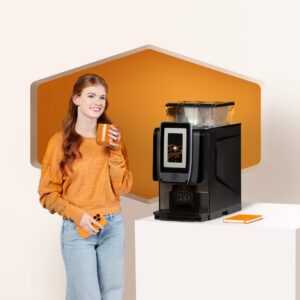
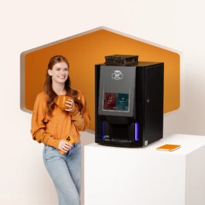
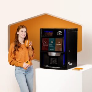
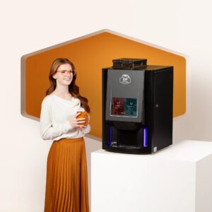
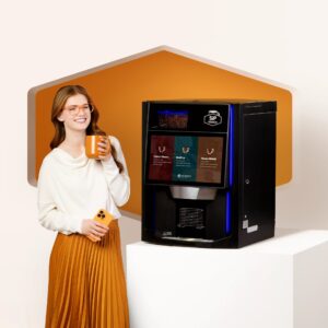
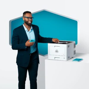
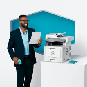
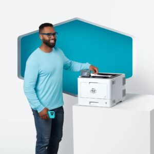
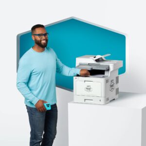
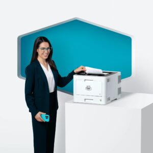
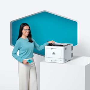
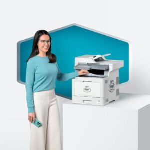
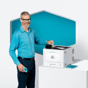
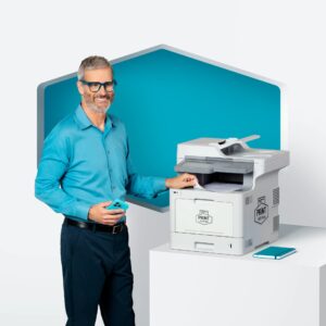
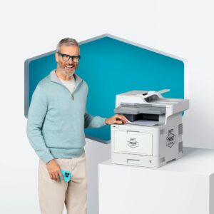
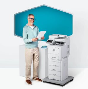
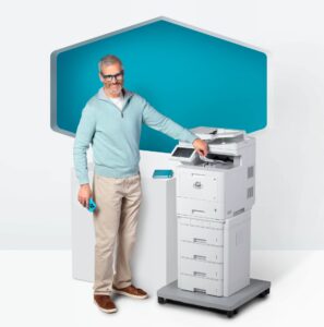
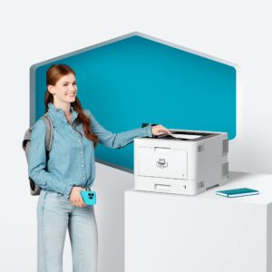
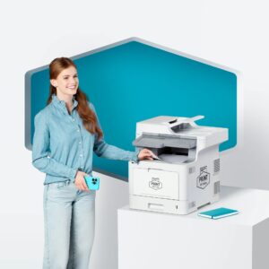
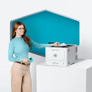
- Model On-Brand
Photography featuring models interacting with our products in branded environments. Each model is chosen to represent a specific audience or industry vertical (e.g., students for student living, property managers for multifamily, professionals for office spaces).
Primary Use: Campaigns, case studies, sales enablement, vertical-specific marketing.
Why It Matters: Creates relatability, helping audiences see themselves in the product experience. This style connects the functional aspects of our products with human stories.
- Lifestyle
Real-world photography of our products in authentic environments — offices, apartment communities, or shared spaces. This style captures how our products naturally integrate into daily life.
Primary Use: Social media, blog content, PR, brand campaigns.
Why It Matters: Brings warmth, authenticity, and context. It shows the real-world impact of our solutions, building emotional connection and trust.
SipWithMe Gallery


PrintWithMe Gallery


Voice & tone
WithMe Brand Voice
WithMe speaks with the authority of a proven leader and the energy of a bold disruptor. Since 2014, we’ve redefined what modern, tech-enabled amenities can look like. Today, our solutions extend beyond amenities into workplace essentials, transforming not just apartment living but industries at large– reshaping the way professionals and organizations experience daily life.
We are confident, modern, and tech-forward– innovators who translate complexity into simplicity, data into insights, and bold ideas into practical solutions. Our voice reflects both our heritage of innovation and our future-facing vision as we scale from startup roots into an established industry leader.
We are thought leaders who challenge the status quo. We balance that authority with a playful irreverence that sets us apart from corporate competitors. The result? A brand voice that is unmistakably ours: bold, approachable, disruptive, and human.
Our voice never changes. It remains consistent across every channel: recognizable, grounded in expertise, and infused with energy. What does adapt is our tone, which flexes depending on channel, audience, and context.
Tone by Channel
Blog & Resource Center
Tone: Authoritative, modern, approachable
Our content reflects our role as industry leaders and trusted advisors. We don’t just report on trends– we connect them to the future of living and working across industries. Articles break down complex topics, from property technology to workplace innovation, into clear, actionable takeaways that empower property managers, operators, and business leaders alike.
We make innovation feel both exciting and accessible, proving that modern solutions can be smart, practical, and people-first.
✅ Do (On-Brand):
“AI-powered amenities aren’t just the future — they’re already changing how property managers save time and cut costs today. At WithMe, we break down the complex tech behind it so you can focus on what matters most: happier residents and more efficient operations.”
❌ Don’t (Off-Brand):
“Artificial intelligence in property technology is a complex and sophisticated trend that requires deep technical expertise to understand. Our platform demonstrates the many ways managers can achieve optimization.”
Social Media
Tone: Conversational, witty, bold
Social is where our personality and disruptor energy shine. Posts are short, punchy, and designed to spark conversation. We lean into wit, humor, and cultural touchpoints, but always anchored in credibility.
Here, we connect directly with communities and professionals across industries– showing them that modern solutions can be as enjoyable as they are innovative. Our social presence feels like a forward-thinking peer leading the conversation, not a distant corporate brand.
✅ Do (On-Brand):
“Your residents don’t want to wait in line for a printer. Your staff doesn’t either. Good news: WithMe fixed that years ago 😉”
❌ Don’t (Off-Brand):
“WithMe is proud to offer a wide array of managed print services designed to enhance the overall resident and staff experience.”
Press & News
Tone: Polished, factual, credible
In press and external news, we position WithMe as an established authority reshaping both the amenity space and workplace essentials. Our tone is clear, professional, and grounded in facts. We emphasize our credibility, scale, and measurable impact, while avoiding corporate jargon or inflated claims.
We highlight not just what we do, but why it matters: the tangible benefits of our solutions for communities, workplaces, and industries. Even in polished communications, our approachable personality comes through in strong, simple language that makes our impact unmistakable.
✅ Do (On-Brand):
“WithMe today announced the expansion of its workplace essentials line, building on more than a decade of success in amenity innovation. Already serving thousands of communities nationwide, WithMe now brings the same modern, tech-forward solutions to offices and organizations.”
❌ Don’t (Off-Brand):
“WithMe is pleased to announce the rollout of additional product offerings. These solutions will diversify our portfolio and help capture new market share within the workplace vertical.”
Customer Communications
Tone: Friendly, empathetic, helpful
Whether a resident, a property manager, or an office administrator, our customers experience us as a knowledgeable guide who’s on their side. Our tone is empathetic, clear, and solution-oriented. We anticipate needs, reduce friction, and make technology feel seamless.
We don’t overwhelm with technical jargon or shift responsibility onto the user. Instead, we take an active role in solving problems with straightforward guidance, ensuring every interaction builds trust and confidence.
✅ Do (On-Brand):
“We’ve got you covered! Your printer is just updating — it’ll be back online in about 3 minutes. If you’re still having trouble after that, reply here and we’ll jump in right away.”
❌ Don’t (Off-Brand):
“Your printer is currently undergoing a firmware update. Please wait approximately 180 seconds before attempting to use it again.”
Campaigns & Marketing Materials
Tone: Energetic, persuasive, future-focused
Our campaigns inspire confidence and excitement, highlighting how WithMe’s solutions are setting the new standard for modern living and working.
The messaging is bold, persuasive, and infused with energy. We show how our products and services are not only reliable and innovative but also delightful, user-friendly, and future-ready. Every campaign reinforces our identity as disruptors scaling with impact, shaping the way people experience both life and work.
✅ Do (On-Brand):
“Modern living deserves modern solutions. WithMe makes it easy for residents and workplaces to thrive with tech that’s reliable, seamless, and (dare we say) actually enjoyable to use.”
❌ Don’t (Off-Brand):
“WithMe provides scalable, innovative solutions that meet the evolving demands of modern communities and workplace clients.”
Consistency Across Channels
Across every channel– from a blog article to a LinkedIn post to a customer support exchange– the WithMe voice is unmistakable: bold, tech-forward, disruptive, and human.
Audiences should instantly recognize us as:
- Established leaders who have scaled beyond startup status.
- Innovators shaping the future of both amenities and workplace essentials.
- Confident disruptors who balance authority with approachability.
- Modern storytellers who make tech feel smart, simple, and exciting.
By pairing thought leadership with a touch of irreverence, we differentiate ourselves from traditional competitors and build trust across industries.
We don’t just reflect where the industry is — we lead it forward.